AngularJS dashboard revamped, dramatically faster for Joomla
The entire Watchful team has been quietly working on a secret project for months. Today, we are thrilled to announce the release of the third iteration of the dashboard with AngularJS.
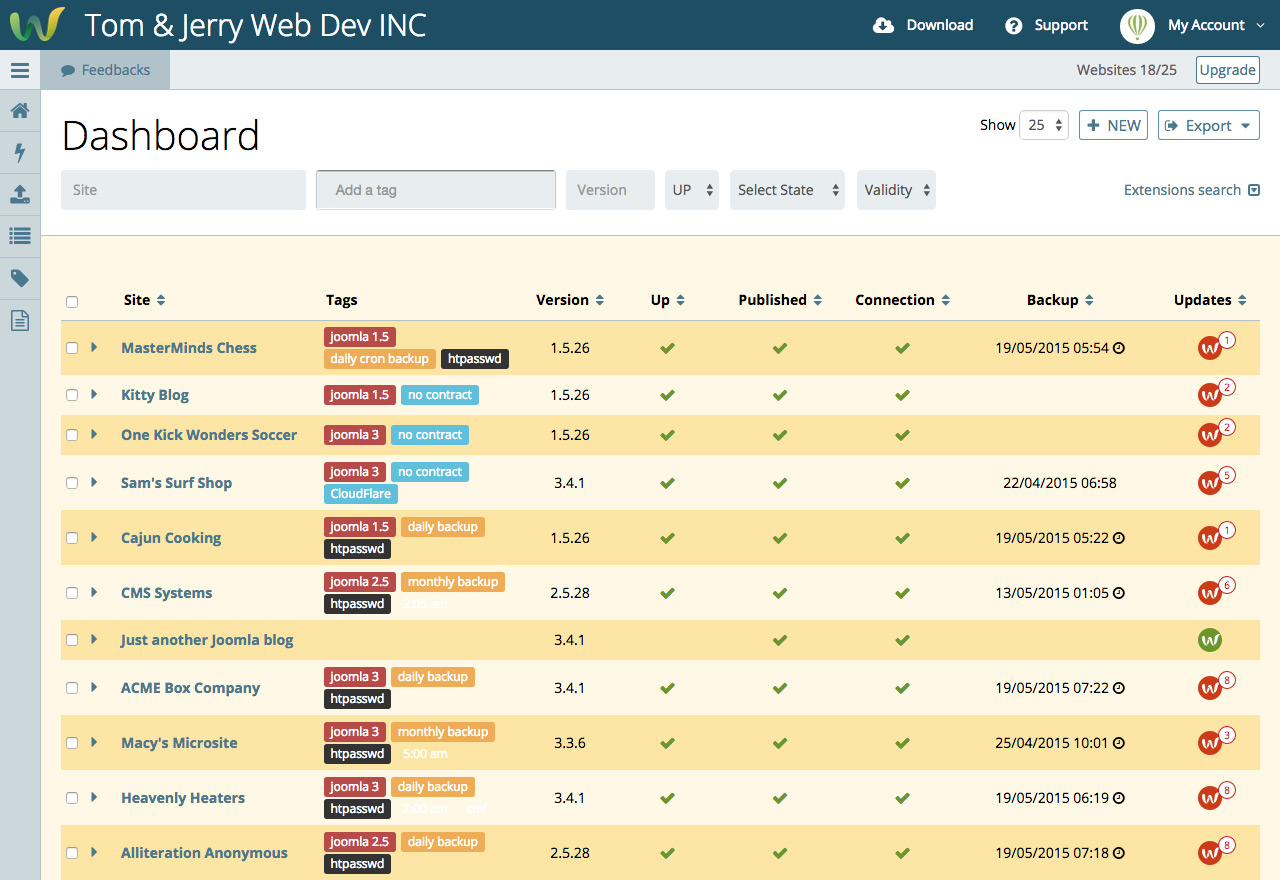
As seen in the screenshot above, the new dashboard has been redesigned for maximum efficiency and rapid decision making.
You can try the new dashboard today as we launch this feature as a public BETA. Simply log in to your account and click the New Dashbord button. Currently, you can switch back to your current Dashboard in the same way.
Making space
The first change existing Watchers will notice is that the toolbar is no longer displayed when you first visit the dashboard.
In fact, all the buttons and links that previously allowed you to analyze your website or perform maintenance are no longer present in the default interface.
This change leaves more space to view more of your sites at once.
What you need to make a decision
We’ve also re-focused the information presented for each website.
Links to the frontend and backend are no longer displayed by default. Rather, we’ve increased the prominence of the tags. While these can be used to filter your dashboard (more on that below), it is common for our users to add important maintenance details in the tags.
For example, you may include maintenance contract status as a tag, which will be very helpful when making maintenance decisions.
Looking closely, you will also notice that the exact time of the last backup is now displayed in addition to the date. For busy sites, being able to quickly see the time of the last backup often saves a few clicks when deciding if maintenance can proceed.
Prioritising maintenance
For many Watchers, the decision making process is not a question of which sites need maintenance, but which sites need maintenance right now.
It is a question of priority.
Perhaps the most important factor that decides maintenance priority is the number of updates pending for each site. Thus, we now display the number of pending updates right on dashboard.
This value is much more informative than only the red/green indicator used in previous versions of the dashboard.
Powerful tools for filtering and sorting
The new dashboard also improves the tools for sorting and filtering the sites in your dashboard, which also help in the decision making process and prioritization.
Sorting the dashboard requires just a simple click of one the column headers.
Filtering is more powerful, and faster also. Just start typing in the site field and the list of sites will filter in real time. This feature made the existing Search button obsolete, saves on mouse clicks, and makes for an more efficient experience.
Perform maintenance without the page refresh
Many Watchers have commented that their decision making process and site maintenance tasks require a lot of switching between two views: the dashboard and site detail.
Since the new dashboard improves the decision making process, the next important task for us was to improve this inefficient workflow.
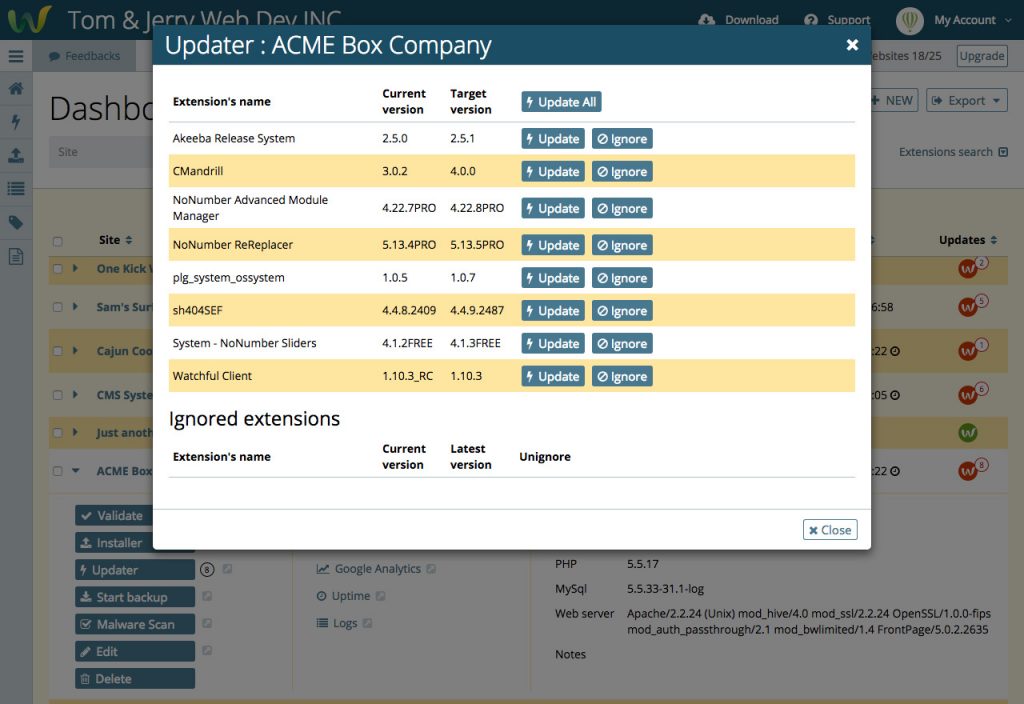
The dashboard now performs maintenance by simply clicking the site name to reveal the detailed site info and all the available tasks. We call this the drawer.
As shown in the screenshot below, selecting the Updater button inside the drawer performs updates in a modal popup.
After completing maintenance, the modal closes, allowing maintenance to continue without the need for a page refresh.
We also use modals for adding and editing sites and tags. The latter is a huge improvement as tags can be modified on the fly without leaving the dashboard.
Faster with AngularJS, especially for large accounts
To realize our goals, it was clear that HTML and CSS would not be sufficient.
Thankfully, a number of excellent JavaScript frameworks are available and we chose AngularJS from Google.
Importantly, when you visit your dashboard with AngularJS, a single query to the database loads all the sites in your account.
Thus, the dashboard filters, sorting, and other dynamic features occur instantly.
The result is a fast and efficient workflow that very closely resembles a desktop-app experience.
Even pagination, which traditionally requires requesting new data, happens quickly as all the site data is already loaded. For users with dozens or hundreds of sites, the effects will be dramatic.
How we got here
The foundations of the new dashboard are two recent developments. First was the release of the Restful API for Watchful that we announced last summer. Second was the ability to continually track the availability of extension updates in real time.
The availability of these features made it effortless to concentrate on the user interface.
Following the Watchful Executive Summit in February, the Watchful CTO Pierre-André Vullioud held a three-day UX sprint in Lausanne, CH with a long-time colleague: Yves Koekkoek of Labo Internet (Nîmes, FR).
Yves is a UX expert, and was instrumental in forming the theoretical basis of the new dashbaord.
The implementation of the aforementioned changes, as per Yves’s analysis, involved the collaborative effort of our entire engineering and design teams, along with extensive internal testing.
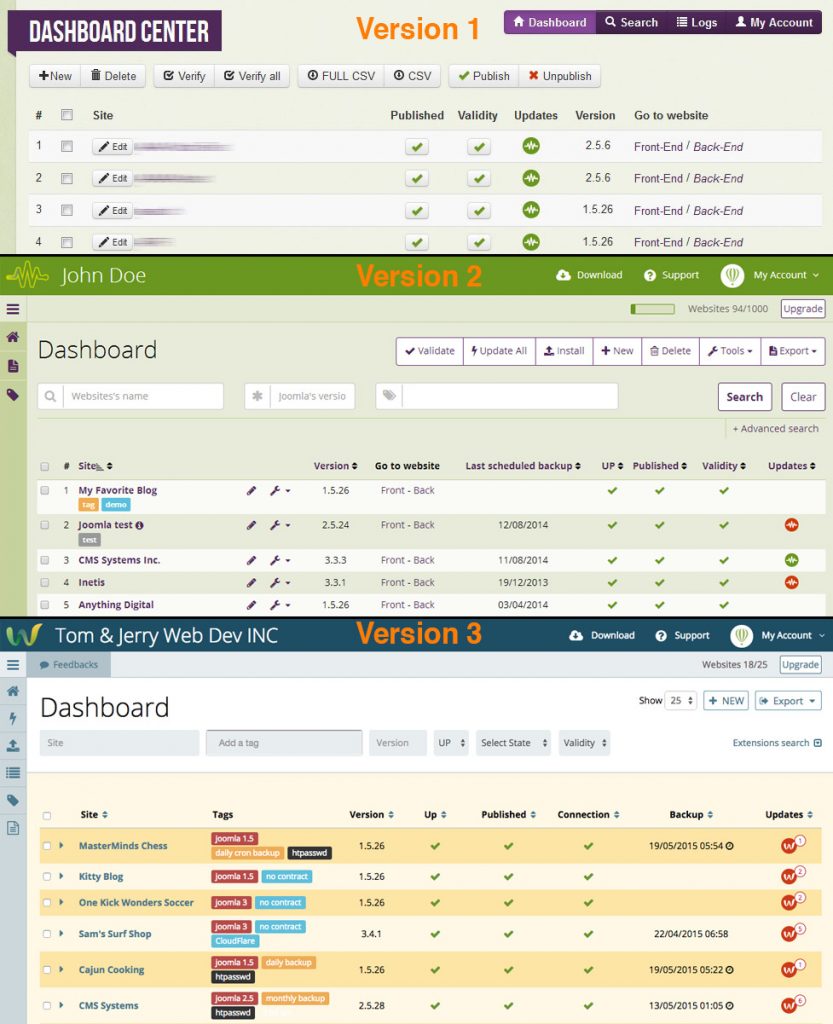
As you can see below, the Watchful dashboard has really come along way during it’s evolution over the last 2.5 years and we look forward to feedback from Watchers on this important update to the UX.
ff


0 Comments